
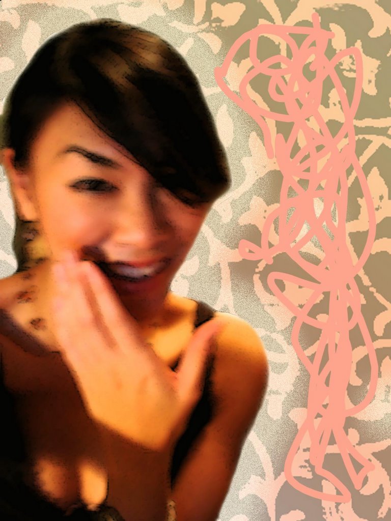
Here is another one of my projects I worked on for Print Productions. This assignment entailed us to use at least 10 images from an image pool that we created as a class. Feedback from the class was that it looked too divided in the center, which i agree...I could have worked harder on this. But my instructor told me it looked finished when I was working on it and I asked him if it was too divided but he said no so...i didn't really think twice about it. I was going to make another collage too but I ran out of time and didn't finish it, I might keep fussing with it to see what I can come up with. Unfortunately, I can't really go back and fix this piece because I didn't save a good copy of this with all the layers...darnit! But what I like about this piece are all the vibrant oranges that come out from behind the dark brown. Nice contrast.
At this moment I'm sitting at the design lab working on homework...god, it's a saturday night and I'm working on homework...boy do I feel like I loser!...No, not loser sarah...i'm a dedicated art student, hardworking, and motivated!!! Must keep telling myself that!!!!!
3 comments:
I like it. I don't think there is anything wrong with the division. The objects that are coming out of the child's head extend into the other space above so it breaks up the line. There's a nice balance on each side both in weight and color. The brown and orange on each side really pulls the piece together. Nice job!
It's a little surprising that you used a goldfish in your image. Don't you hate seeing fish out of water? The cut off head of the child may be a bit disturbing for some viewers, but the fish must be more disturbing for you, especially with the kid riding on its back.
Well if you think you are a loser, then I'm probably 10 times that when I was in college. I spent many nights and weekends at the library doing homework.
Hey, thanks...that's what my teacher said about the dividing line too while I was working on it, he said the same about the stuff coming out of the child's head spilling on over to the other edge. The image of the child's head was already cut off, so that's why I chose to have things coming out of her head. Later I found out that the child actually battled cancer and need stem cells and all that jazz...the girl that provided the image didn't warn the class before using it that that girl went through a lot...but anyway.
Yeah...fish out of water! I know, I hate it! But the funny thing is that I find I end up drawing or having fish in my art work pretty regularly. It's really odd, but i've noticed it too.
This particular piece is mainly about how children's minds run a million miles per second and they let their imaginations carry them away. What the world may show a child, a child may see it in a totally different way.
wow that looks so good! i'm sooo impressed by your artwork:) I especially like that scary looking baby with a brown thing in his left eye hahah:) i still remember the toilet you made outta that chair, it was fantastic!!
And also, when i was in hs i learned in psych class that you dreamt in black and white, but there could be a few objects that have a bright color, and they stand out and are some critical part of your dream. But the more i read up on it, i found that you can dream in color, and people were trying to make the case that the older generation (the one that was only exposed to black and white tv's)could only dream in black and white and we can now dream in color, because we have color tv's. i thought that was kinda a bogus explanation, because they still saw real life in color, i don't think dreams are based on tv. I dream in color too... but back when i wrote that, i was under the impression that you only dreamt in black and white. so there you go:)
Post a Comment